TL;DR
Problem:
The National Football League (NFL) is one of the highest-earning organizations in the world. To sustain this growth, complacency must be avoided. Continuous innovation and iteration are crucial to the NFL's ongoing success. But how can this be achieved? I was tasked with conducting research and providing recommendations to boost site retention and improve customer satisfaction on the NFL’s mobile app.
Solution:
I recommended the integration of search functionality, increased user autonomy, and expanded personalization options. These enhancements would give users greater control over their experience, allowing them to tailor what they see and interact with according to their preferences.
Impact:
Personalization fosters a sense of loyalty, making users feel more connected to the app. When users experience tailored interactions, they are less likely to switch to competitors, resulting in higher retention rates and increased customer lifetime value. In today's competitive app market, personalization is a key differentiator—apps that offer customized experiences are more likely to stand out, attract, and retain users. With content that aligns with their interests, users are more engaged, spending more time on the app and returning for future interactions.
THE CLIENT
The National Football League, NFL, founded in Canton, Ohio in 1920 is America's highest revenue sports league. Comprised of two conferences, the American Football Conference (AFC) and the National Football Conference (NFC), the NFL houses 32 teams spanning from coast to coast. Their mission is to "unite people and inspire communities in the joy of the game by delivering the world's most exciting sporots and entertainment experience".
THE CHALLENGE
In 2024, the NFL Mobile App continues to grow, serving over 130 million users, but a noticeable lack of personalization still exists.
I posit that enhancing customization options would significantly benefit users by allowing them to tailor their experience, leading to higher site retention. When users have more control and flexibility in navigating the app, they are more likely to engage with content that aligns with their interests. This, in turn, supports key business objectives—higher retention typically correlates with greater customer satisfaction, loyalty, and increased sales. By improving the user experience, the NFL Mobile App can continue its growth and maintain its mission of delivering an 'exciting entertainment experience.
The Assignment:
📝Conduct research and propose recommendations based in data/results that provide probability for the NFL to increase site retention and customer satisfaction.
RESEARCH & PLANNING
Competitive Analysis
To start, I wanted to explore the user experiences offered by other major sports leagues. I analyzed the mobile apps of Major League Baseball (MLB), the National Basketball Association (NBA), Major League Soccer (MLS), and the Women's National Basketball Association (WNBA). While each app demonstrated clear trends in personalization, there were also opportunities for improvement. Let me walk you through my findings.
⚾️ Major League Baseball (MLB)Analysis
The MLB prompted the user to pick their favorite team(s) in the league. Once completed with all prompts there was only one team showcased at the top of the user's home screen feed (the first team the user selected). The other teams were 3 clicks away under "Followed Teams".

Screen prompting user to follow favorite teams.

Screen showing user what selections were made.

Screen within app showing "favorite team" and "followed teams".

Home screen within app showcasing favorite team.
⛹🏿🏀National Basketball Association (NBA) Analysis
NBA - Prompted the user to pick their favorite team(s) and player(s) to follow around the league. Once all prompts were completed players and teams were showcased at the top of the feed in a horizontal scroll (like Instagram) behind a few trending or latest topics.

Screen allowing user to select and follow favorite teams

"For You" screen displaying highlight of favorite team selected previously.

Screen with "favorite" team selected along with option of "No Favorite".

Screen allowing user to select and follow favorite players.

"For You" Screen displaying the look when no favorite team is selected from previous picked teams.
⚽️Major League Soccer (MLS) Analysis
MLS - Prompted the user to only pick 1 favorite team in the league. It then prompted the user to select subjects they were interested in seeing on their feed. Once all prompts were done the team selected was located on the top header along with a downward caret which then showed the other teams that could be viewed. The topics that were previously selected were located in the bottom navigation under more.

Screen allowing user to pick favorite club.

Screen allowing user to select topics that interest them.

Screen allowing user to allow particular alerts.

Home screen showcasing favorite team at top of feed.
⛹🏾♀️🏀Women's National Basketball Association (WNBA) Analysis
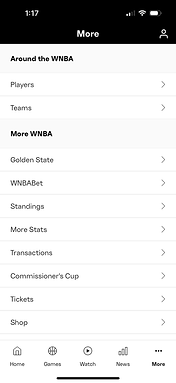
WNBA - This was the first app I encountered that did not prompt the user to pick a favorite team or player. The homepage was filled with "Top Stories" and "Must-See Moments". Players and Teams were accessible in the bottom nav under "More".

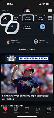
Home screen displaying latest trending topics.

"More" screen allowing users to explore what else the app offers.
🏈National Football League (NFL) Analysis
Similar to other mobile apps, the NFL app followed some of the same personalization trends but also presented opportunities to further expand its competitive advantage over other sports leagues.
NFL - The app prompted the user to pick only 1 favorite team, however, this was the only attempt in personalization the app provided. No prompts for selection of favorite players or what topics the user might be interested in seeing. Like the other apps, the user can edit their favorite team and look at other teams as well. In regards to players, users can only see what the app provides such as states and player information. The scarcity of personalization gives a plethora of space for expansion and evolution to customize the app for customers.

Screen prompting using to pick favorite team.

"Home" screen displaying favorite team at the top of page.

"Home" screen accompanied with news and trending topics around the NFL.
Empathy Map and Observation
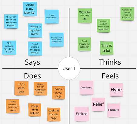
Pairing my competitive analysis with observations of participants' reactions to each mobile app was crucial. I aimed to capture their likes and dislikes, which would help identify positive trends and opportunities for the NFL mobile app. To achieve this, I observed users interacting with each app and documented their experiences using an empathy map during each session.

MLB empathy map

MLS empathy map

NBA empathy map

WNBA empathy map

NFL empathy map
Positive Observations:
➕Ability to select favorite team
➕Ability to select favorite player
➕Ability to select multiple favorite teams and players
➕Ability to handpick certain topics to see on home screen
➕Ability to change favorite team
➕Ability to find favorite teams and players with 1 click.
Negative Observations:
➖Selecting multiple favorite teams in onboarding, but they are not all displayed on user's home screen.
➖No search bar
➖Unable to select multiple teams
➖Unable to select players
➖Assumption that user wants to see certain subjects instead of asking what they would like to see.
How Might We?
Derived from the observation and empathy maps, I was able to construct "how might we" questions that generate creative ideas and solutions while keeping me focused on the scope of the challenge.
"How might we give more autonomy to the user regarding what they want to see?"
"How might we design a positive experience for the user that is curate for and by them?


Guided by the principle of 'good, better, best,' I made it a point to ask myself questions that ranged from practical to those that challenged conventional thinking. This approach is what makes these inquiries exciting—it sparks creativity and encourages continuous consideration of how to enhance the user experience in the future.
Affinity Mapping
Clear trends emerged from the 'how might we' questions and prior observations, allowing me to categorize key objectives that required further research. These included personalization, user autonomy, tracking, unmet needs, desires, accessibility, and overall aesthetics.

The NFL Mobile App by no means wants nor needs to be like the other sport league apps. However, given how there are similar target users and audiences with all the apps, I began to think about the customization features of the other apps and how they could be elevated within the NFL app to further distinguish them in the market.
Survey
An extensive list of curated questions was significant, making it essential to gather insights directly from actual NFL customers. I developed a survey that covered various topics, including participants' level of engagement with the NFL, descriptions of their involvement, app preferences, pain points, favorite teams and players, and personalization options. The data analytics from the survey provided valuable feedback, and some key findings are highlighted below.

This data clearly demonstrates the NFL's widespread popularity across various demographics, including race, gender, and age. All participants indicated that they engage with the NFL in some capacity.
This is significant because it suggests that while football is the primary draw, there are numerous avenues within this realm that attract people's interest.
The previous questions was, "Do you use the NFL Mobile App?". Those who said yes, fortunately do not air on the negative side.
However, the majority do not feel overwhelmingly satisfied and this suggest changes or additions need to be made.


Most participants have a favorite player they enjoy following, but this engagement occurs outside the NFL app, as player tracking is not a feature within the app.
This raises the question: why should users need to turn to another app when the NFL app claims to encompass all things NFL, including player information?
The data indicates that most NFL consumers enjoy following multiple teams.
Unfortunately, the app currently limits users to following only one team. This presents a significant opportunity to enhance customer satisfaction by allowing users to select and follow multiple teams.


This data aligns with the previous findings, indicating that most users enjoy following multiple players.
Implementing a feature that allows users to do so would be beneficial for both the users and the NFL's business.
When it came to users' preferences for what they wanted to see, responses varied widely. Below are some of the key responses:
💭Players involvement in civic duties
💭What the team is up to outside of games
💭Positive stories
💭Team Improvements
💭Defensive and offensive lineups
💭How players of a certain position stack up against each other
💭Games and wins
💭Type of plays team runs and exciting catches
RECOMMENDATIONS
Based on the research, data, and findings, I was able to formulate recommendations aimed at enhancing user personalization and customization, which would, in turn, boost site retention and customer satisfaction.
🔋Add a search bar or icon for users to look up exactly what they want.
🔋Allow for the selection of more than one favorite team.
🔋Allow for the selection of player(s).
🔋Showcase players and teams on the field as well as off.
🔋Ask user what they would like to see.
🔋Have selected favorites at top of home screen for easy access and fit mental models.
🔋Create a different icon for "teams" in bottom navigation. It is currently the favorited teams mascot, and causes confusion.
🔋Ask permission to track or use location of user to better fit thier likes.